Data
A 2-year Compendium of Running Data from Nike Run Club processed with Strava
Introduction
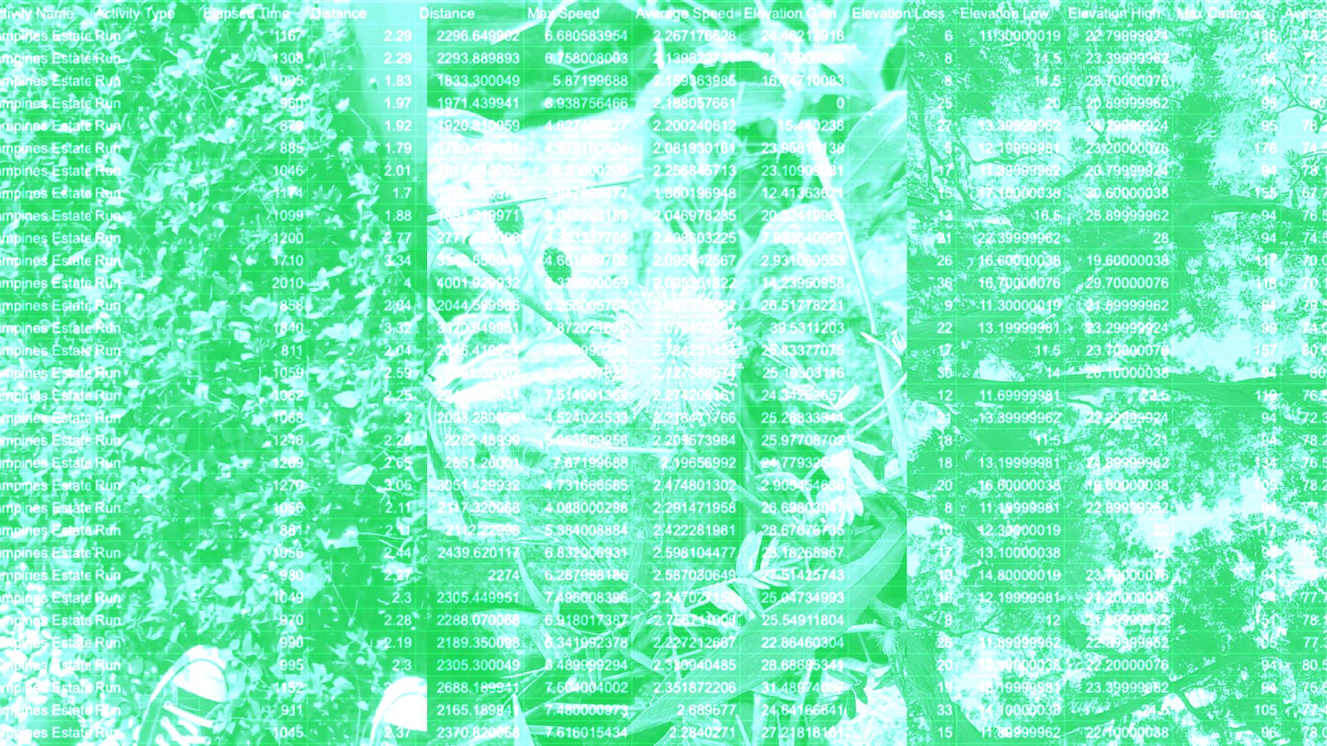
The main device used regularly when I exercise is the Nike Run Club Mobile Application which I have been using for the past 2 years. Using this mobile application, I hit the “start" button within the app which records the entire duration of my running and I click the stop button when I reach my desired stop point. Most of my runs consist of 2.5 to 3km. With the constant duration and distance ran throughout these years as a form of stress-relief, it was a good guage to try to gain deeper insights between the variables from my app data. I converted the Nike Run Club Mobile Application with an external third-party application that converted the data into my Strava account which revealed more data points that were not present in the Nike app interface itself.
I was able to download the Strava app data as a CSV file which was emailed to me from the mobile application. It includes a comprehensive table of data ranging from speed to cadence. I sorted the data and decided to focus on two variables found to have a direct relationship.
Data Visualisation
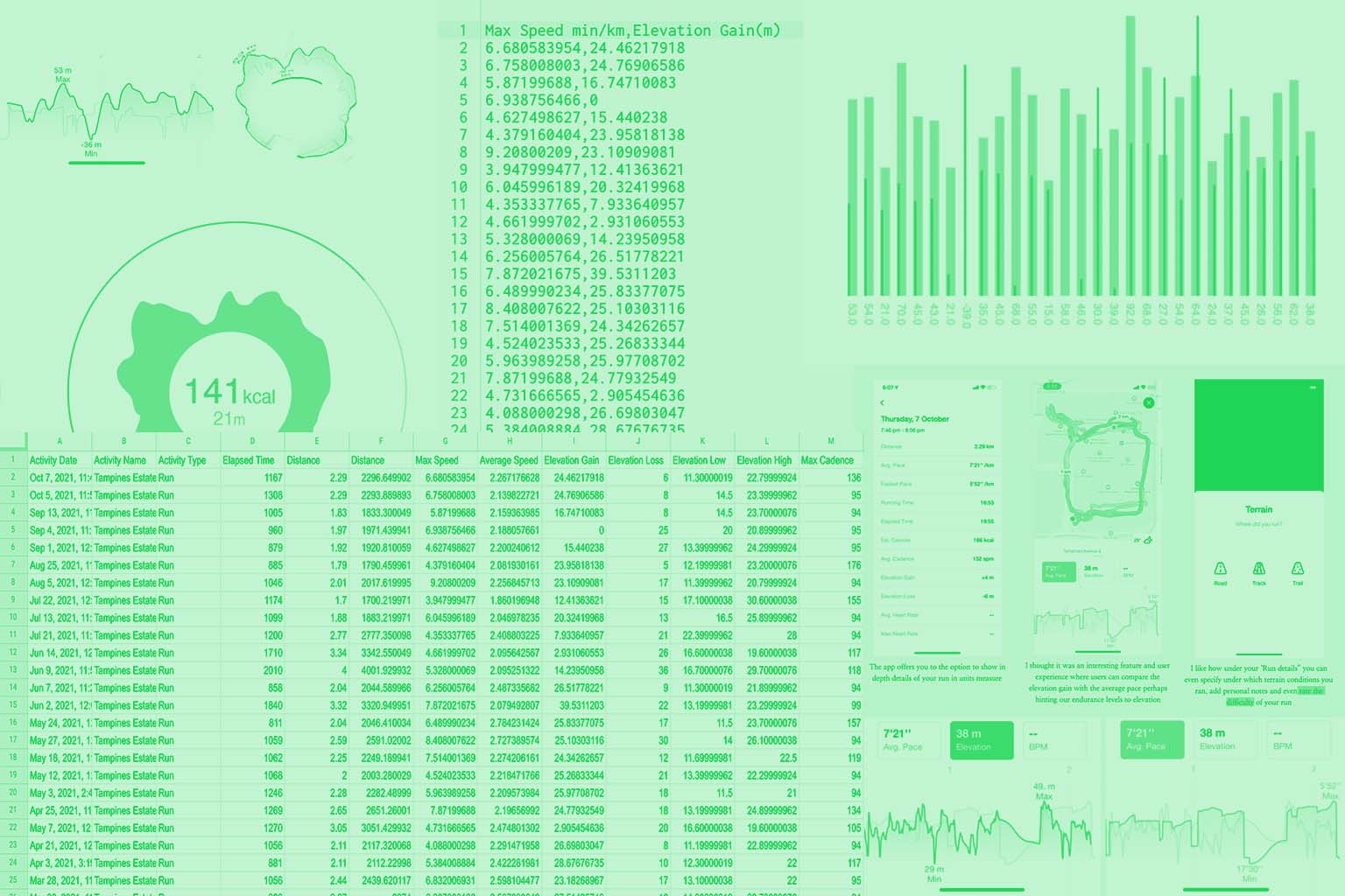
Using my data CSV file I created a line graph and bar graph in p5js. I decided to investigate elevation gain; also known as the height of the ground during the running route. In rearranging my data sheet in highlighting the two variables: elevation gain and calories, I managed to see noticeable results from the data. I edited and combined the line and bar graphs in Adobe Illustrator to depict a clearer relationship between the two variables.
Findings
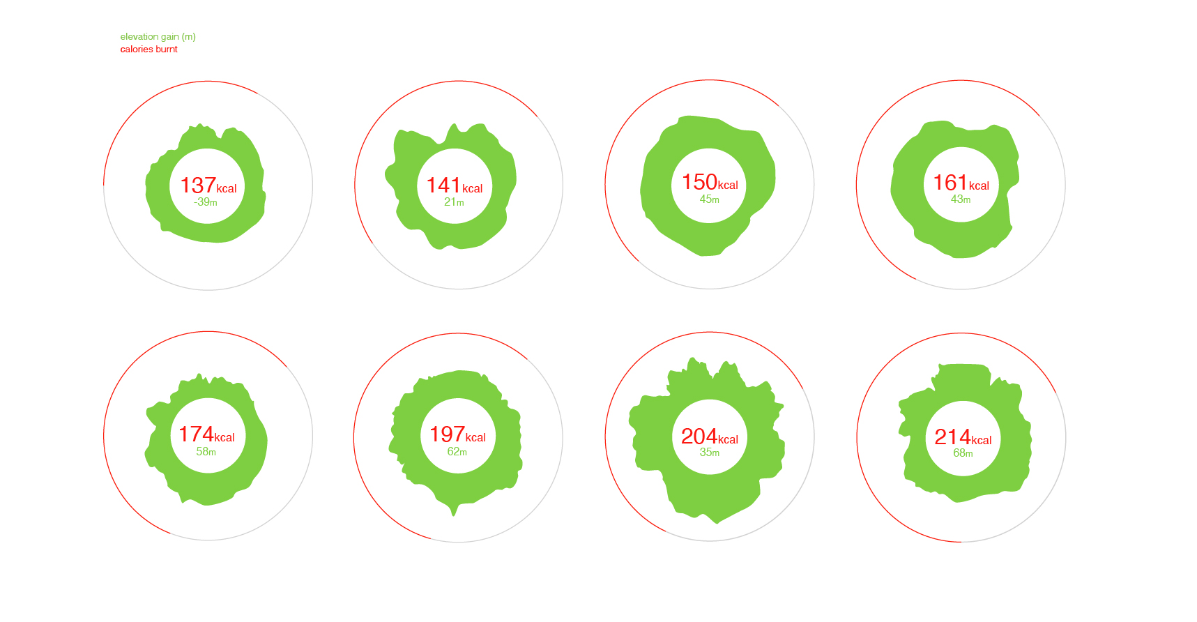
The circular graph created is derived from the Nike Run Club App data where elevation gain is depicted for each day in a precise line graph which is warped here to form a circle and is edited in with the calories for the respective run. The image here shows selected runs of increasing elevation gain showing a direct relationship where the calories burnt from that run rises.
The bar graph depicts 30 different runs showing two variables. In the bar graph, the larger heights in the bars against the line representing calories points to a clear relationship between calories and elevation gain. In the circular graphs too, the green shape form representing elevation gain gets larger as more calories get burnt.
Insights
The graphs give a direct insight such that the higher the elevation gain in the run, the more calories being burnt. Other variables such as the running route and distance in the data is kept the same and hence, an obvious development is seen. The different shape formations in the second graph also sparked some interest into how the final artefact could look like. Perhaps, forming sprouting flowers from the different routes that people could travel to for better calorie burn.
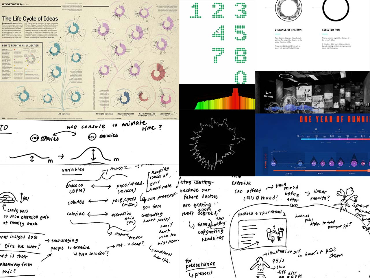
I also explored the Nike Run Club app user interface itself to gain more insight into how I can present and design my data, keeping in my mind that data representation is meant to be functional all while being pleasing to the eye.

Conclusion
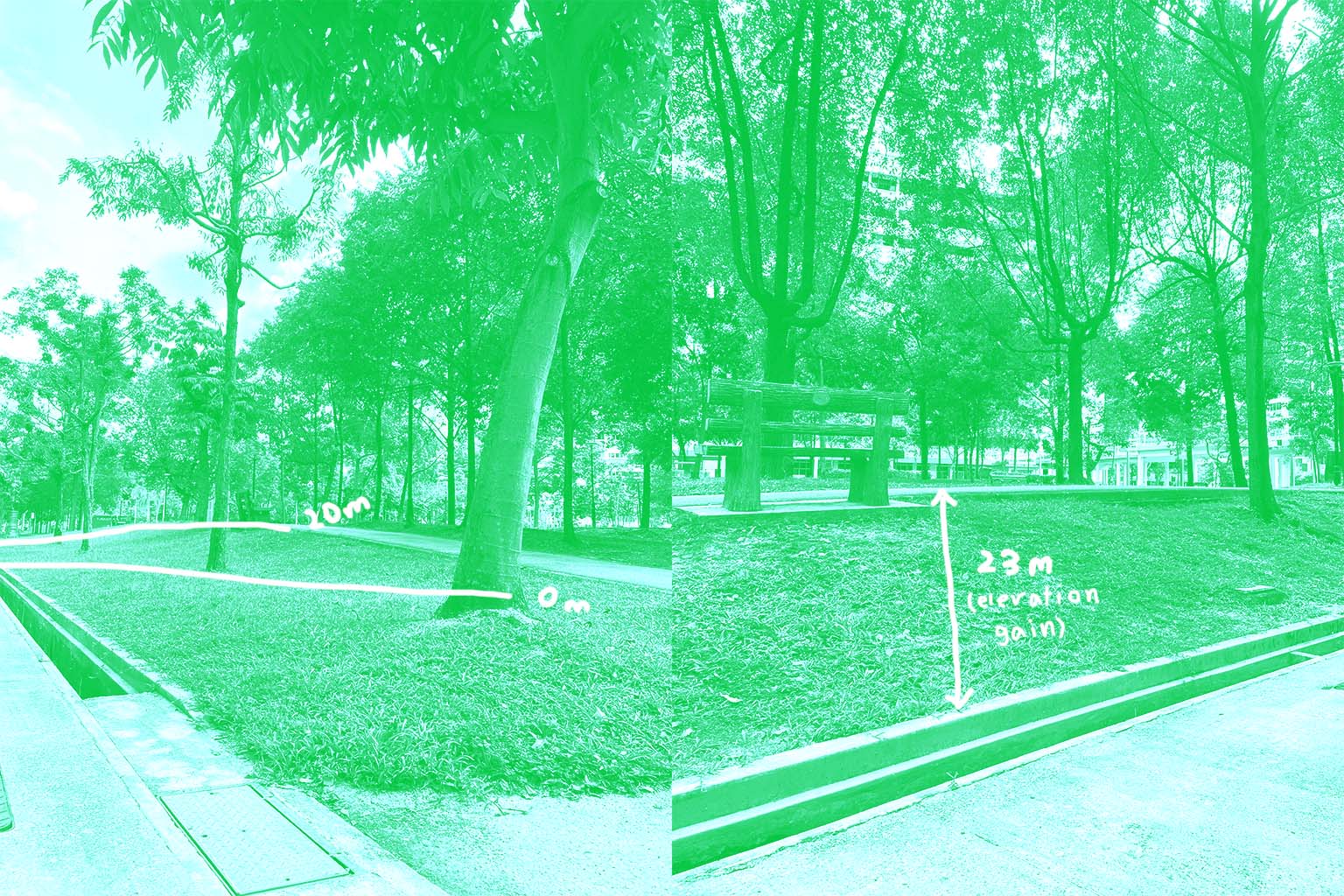
The dataset and findings derived is as a message for people to explore nature more often in relation to fitness and overall well-being. Millennials may sometimes overlook the invisible benefits of being around nature. It could be a way for people to look into different routes with higher elevation gain and explore their richness of nature while burning more calories for a overall physical and mental health refresh.
References
- Girogia Lupi's Life Cycle of Ideas; http://giorgialupi.com/new-page, eu fermentum sodales mauris.
- Biophilia and Nature; https://www.nrdc.org/experts/maria-mccain/bringing-outdoors-benefits-biophilia.
